On its sixth birthday, the Discord messenger introduced a new brand look. When developing, the results of a survey of more than 26 thousand community members were taken into account, according to the company’s blog.
Updated logo
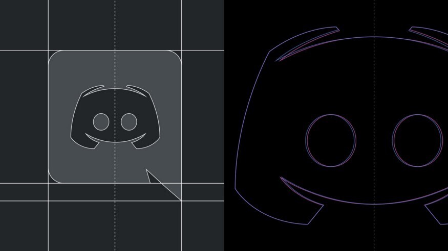
The hero of the logo, whose name is Clyde, has been made symmetrical and its shape more square. The creators believe that this makes the logo look friendlier, clearer, more unique, but remains recognizable for regular users.


New Discord font
The Discord name now uses its own font based on the Ginto font. With the updated text logo the authors want to express the playfulness of Discord.
Updated brand colors
The authors say the old colors were “a little pastel” and “hard to name,” such as “dark but not black” and “not quite black.” In the new style, the signature purple is brighter and more saturated. Discord also added red to its color palette.
New slogan
Discord’s new slogan is “Imagine a Place. The slogan reveals the idea that messenger is a place of various activities for people around the world. The service estimates that 150 million people use Discord each month.
Users will see design changes on the Discord website. The app will update the typography and images on the login and registration pages. Inside the messenger, the upper left corner will get a new logo and colors. Till the end of the year in the application will update the hint illustrations.






Old font looks better!
What is that stupid font omg. Did a child pick that font?
Hello Goodday , not only the font , also the type part with channels . I would like to know what the hell is going on!